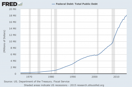
#1 The National Debt
Just prior to the last recession, the U.S. national debt was a bit above 9 trillion dollars. Since that time, it has nearly doubled. So does that make us better off or worse off? The answer, of course, is obvious. And even though Barack Obama promises that “deficits are under control”, more than a trillion dollars was added to the national debt in fiscal year 2014. What we are doing to future generations by burdening them with so much debt is beyond criminal. And so what does Barack Obama want to do now? He wants to ramp up government spending and increase the debt even faster. This is something that I covered in my previous article entitled “Barack Obama Says That What America Really Needs Is Lots More Debt“.
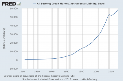
#2 Total Debt
Over the past 40 years, the total amount of debt in the United States has skyrocketed to astronomical heights. We have become a “buy now, pay later” society with devastating consequences. Back in 1975, our total debt level was sitting at about 2.5 trillion dollars. Just prior to the last recession, it was sitting at about 50 trillion dollars, and today we are rapidly closing in on 60 trillion dollars.
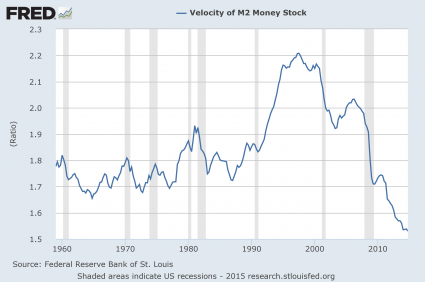
#3 The Velocity Of Money
When an economy is healthy, money tends to change hands and circulate through the system quite rapidly. So it makes sense that the velocity of money fell dramatically during the last recession. But why has it kept going down since then?
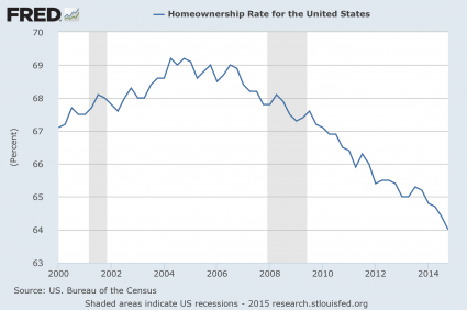
#4 The Homeownership Rate
Were you aware that the rate of homeownership in the United States has fallen to a 20 year low? Traditionally, owning a home has been a sign that you belong to the middle class. And the last recession was really rough on the middle class, so it makes sense that the rate of homeownership declined during that time frame. But why has it continued to steadily decline ever since?
#5 The Employment Rate
Barack Obama loves to tell us how the unemployment rate is “going down”. But as I will explain later in this article, this decline is primarily based on accounting tricks. Posted below is a chart of the civilian employment-population ratio. Just prior to the last recession, approximately 63 percent of the working age population of the United States was employed. During the recession, this ratio fell to below 59 percent and it stayed there for several years. Just recently it has peeked back above 59 percent, but we are still very, very far from where we used to be, and now the next economic downturn is rapidly approaching.

at http://theeconomiccollapseblog.com/archives/10-charts-which-show-we-are-much-worse-off-than-just-before-the-last-economic-crisis
No comments:
Post a Comment